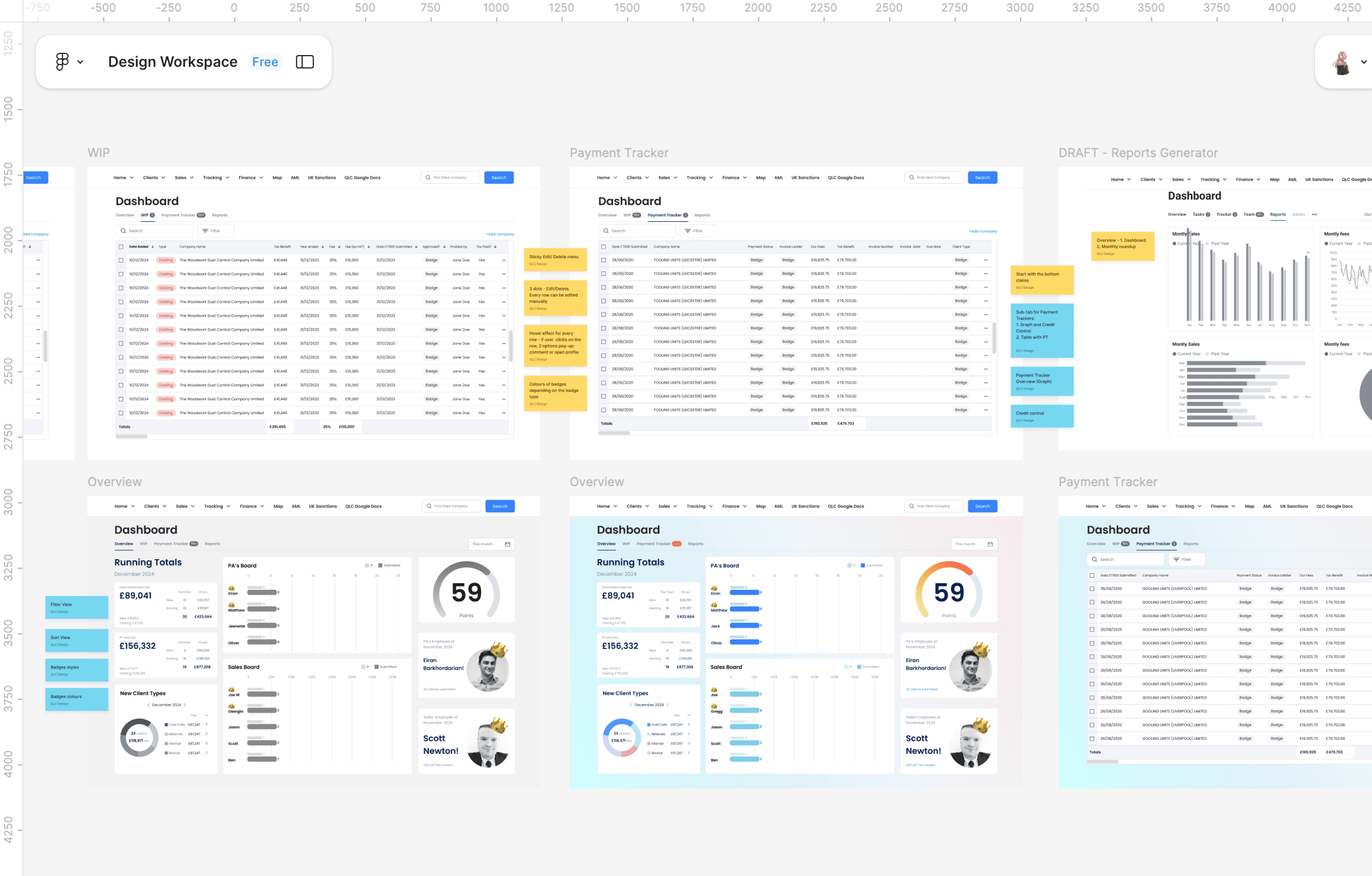
QLC Internal Dashboard: From Spreadsheet to Interactive Tool
This dashboard replaced a company-wide Google Sheet and became a central hub for financial, ops, and leadership tracking
“Can you move this spreadsheet into the Admin app real quick?”
That was the brief. And on the surface, it sounded simple. But this wasn’t just a spreadsheet — it was a mission-critical tool used by multiple departments to run the business.
Each team relied on their own tab in a shared Google Sheet to:
📈Track progress on client companies
🧮 Calculate revenue and monthly bonuses
🧾 Monitor payments, IPs, and lead types
💸 Keep financial records up to date — often manually
People had to switch constantly between the Admin App and the spreadsheet just to complete basic tasks.
This was the hardest project I touched at QLC. It was messy, complex, and unclear — and I loved it.
What I learned:
🔹 Don’t take vague briefs at face value — dig deeper.
🔹 “Just do it quickly” project can hide real complexity.
🔹 The most invisible tools often carry the most weight.
🔹 Logic documentation can be more powerful than pixels.
🔹 Quiet clarity is its own kind of leadership.
This was the hardest project I touched at QLC.
It pushed me to lead under pressure, build clarity from chaos, and design something built to scale — even if it wasn’t shiny or public-facing.
I’m proud of it.
And it’s exactly the kind of work I’d do again — especially for mission-driven teams solving messy, high-impact problems.