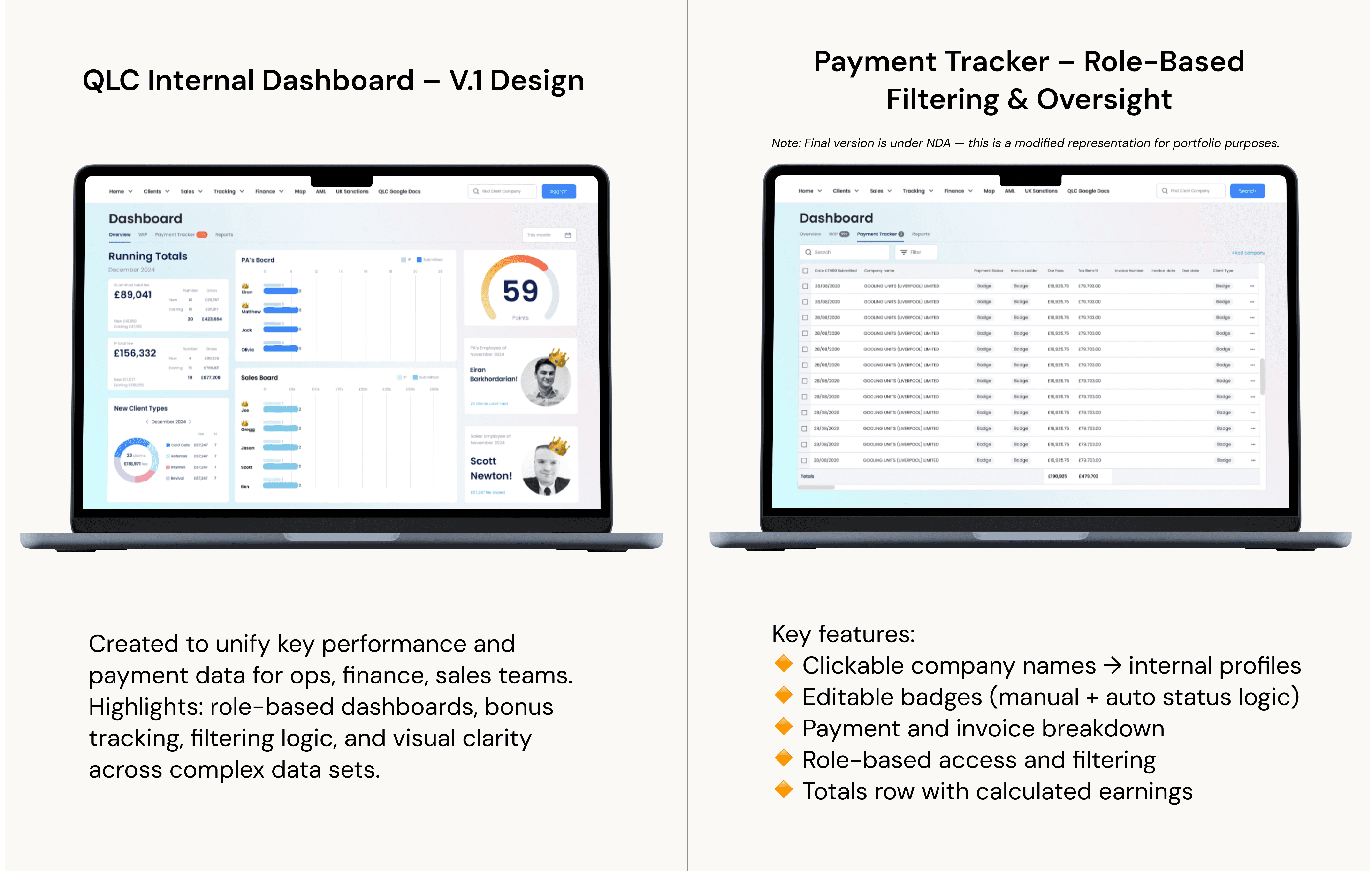
QLC Internal Dashboard: From Spreadsheet to Interactive Tool
This dashboard replaced a company-wide Google Sheet and became a central hub for financial, ops, and leadership tracking
The Challenge - Startup Time Constraints!
The Challenge - Startup Time Constraints!
The Challenge - Startup Time Constraints!
“Can you move this spreadsheet into the Admin app real quick?”
That was the brief. And on the surface, it sounded simple. But this wasn’t just a spreadsheet — it was a mission-critical tool used by multiple departments to run the business.
Each team relied on their own tab in a shared Google Sheet to:
📈Track progress on client companies
🧮 Calculate revenue and monthly bonuses
🧾 Monitor payments, IPs, and lead types
💸 Keep financial records up to date — often manually
People had to switch constantly between the Admin App and the spreadsheet just to complete basic tasks.
As the sole product designer on this project, I was responsible for turning a sprawling Google Sheet — used daily by ops, finance, accounting, and leadership — into a clear, functional dashboard inside our internal admin app. I led the entire process under tight time pressure.
I knew a simple copy-paste into the app would backfire — so I paused and asked:
❓Who’s using this?
❓What are they actually trying to do?
❓What do they need daily vs. monthly?
❓What can we cut or simplify for a better v1?
I interviewed operations, accounting, and finance team members. I asked how they really used the sheet. I mapped out pain points, actions, and calculations (like bonus logic and IP tracking) and grouped features based on:
🔹 Daily vs. occasional use
🔹 Team-specific needs
🔹 Critical filters and edge cases
🔹 Metrics used in bonus calculations
This research shaped the core logic and saved time later — both for design and dev.
Before touching high-fidelity UI, I created quick grayscale mockups and shared them with our COO. Her response was clear:
“It is a game changer and exactly what we needed — clear, intuitive, and built with everyone in mind. I’m genuinely excited about this — finally, a dashboard that makes our lives easier!”
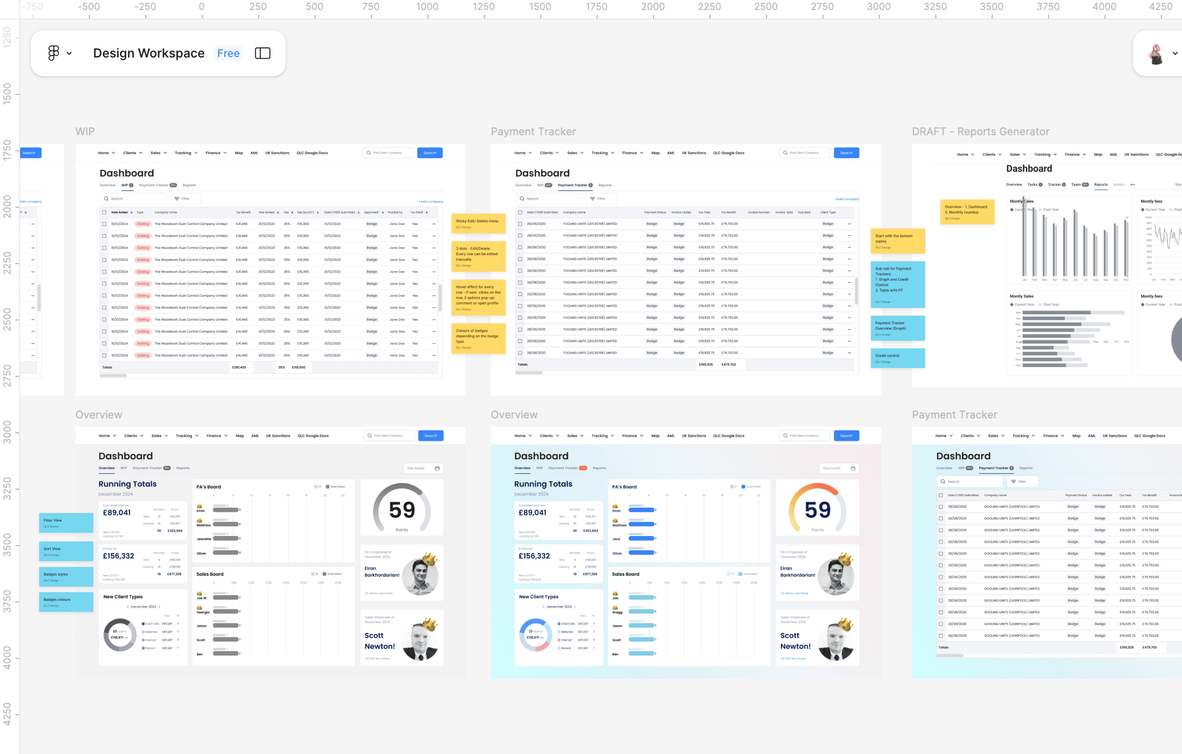
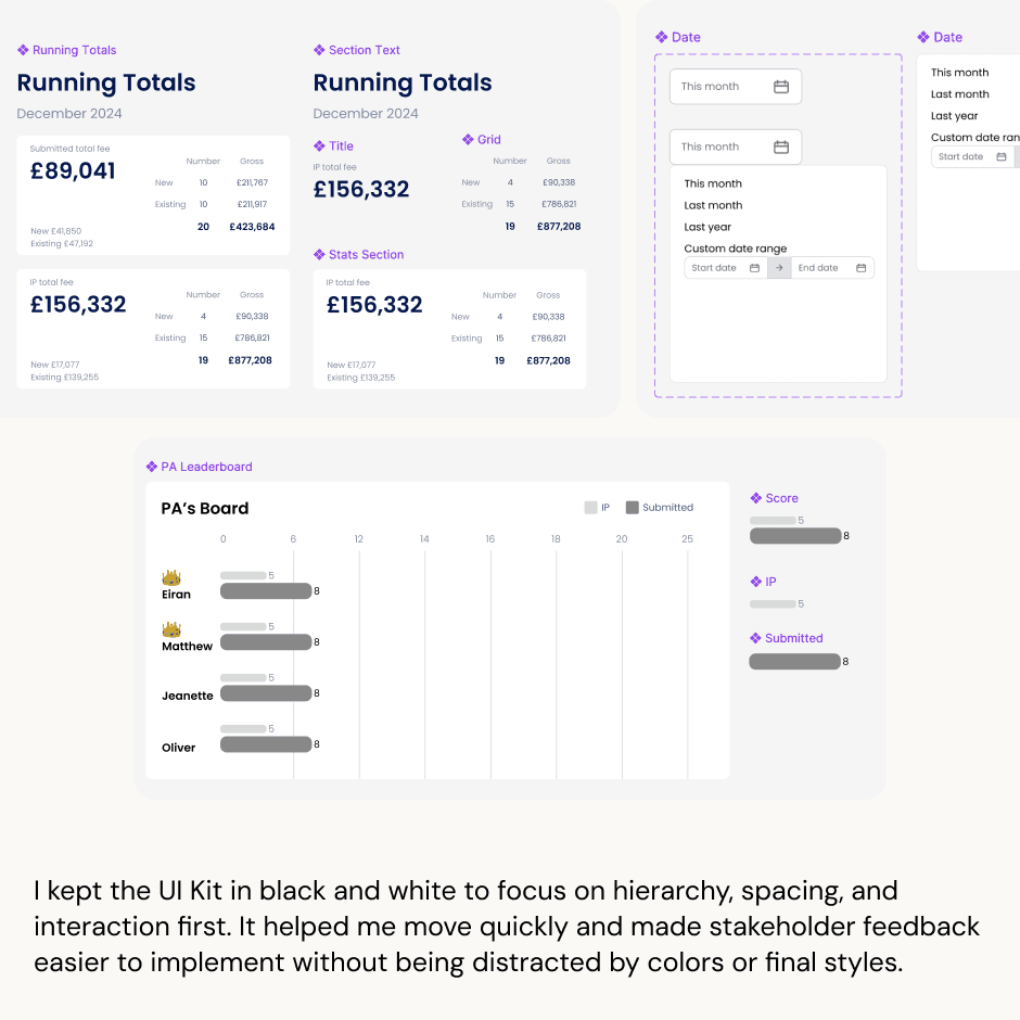
I designed the dashboard using a clean, internal UI kit I built from scratch.
To move quickly and still keep things consistent, I created a lean UI Kit based on atomic design. While it wasn’t polished like a full design system, it gave me total flexibility — every element could be swapped, updated, or reused across dashboard screens.
I kept everything in black and white to stay focused on clarity and speed. It also helped when presenting work-in-progress to the team — people focused on structure, not colors.
The system included:
Leaderboard cards and points trackers
Financial tables with inline actions
Custom filter chips, dropdowns, and date ranges
Responsive layouts for large datasets
The design wasn’t just visual — it was tied to user logic and company structure. Every element supported a specific workflow or decision.
🛠️ 3 teams unified into a single tool (ops, finance, and leadership)
😎 Replaced 10+ spreadsheet tabs with a clean, filterable, user-friendly dashboard
🧘 Reduced tool-switching time by an estimated 30–50%, based on how often users jumped between the admin app and Google Sheets
📑 Enabled real-time filtering and sorting, replacing manual lookups across 1,000+ rows
🏆 Designed logic that supports monthly performance tracking, impacting team bonuses and transparency
👩💻 Simplified report generation for leadership — the new Reports tab replaces manual slicing across multiple tabs
🔧 Design/Dev Efficiency:
🔸 Delivered the dashboard design in under 3 weeks despite no initial brief
🔸 Created a scalable UI kit with reusable components (e.g., filter chips, table rows), saving dev time across other projects
🔸 Used black-and-white wireframes to align stakeholders quickly and surface hierarchy issues early
This was the hardest project I touched at QLC. It was messy, complex, and unclear — and I loved it.
What I learned:
🔹 Don’t take vague briefs at face value — dig deeper.
🔹 “Just do it quickly” project can hide real complexity.
🔹 The most invisible tools often carry the most weight.
🔹 Logic documentation can be more powerful than pixels.
🔹 Quiet clarity is its own kind of leadership.
This was the hardest project I touched at QLC.
It pushed me to lead under pressure, build clarity from chaos, and design something built to scale — even if it wasn’t shiny or public-facing.
I’m proud of it.
And it’s exactly the kind of work I’d do again — especially for mission-driven teams solving messy, high-impact problems.