Redesigning Login & Onboarding for a Seamless User Experience
How we improved the first impression, reduced friction, and increased engagement
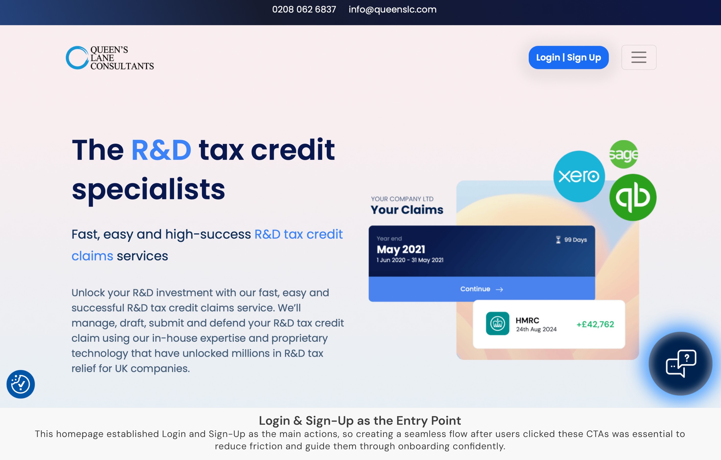
The Challenge: Why We Needed a Redesign
The Challenge: Why We Needed a Redesign
The Challenge: Why We Needed a Redesign
The existing login and onboarding experience at QLC was outdated, causing high drop-off rates and user confusion.
🔹 Users struggled with unclear steps and lack of guidance
🔹 The flow wasn’t optimized for mobile users, leading to frustration
🔹 With a website relaunch and marketing push, we needed a smooth first-time experience to retain new leads
It was clear: a redesign wasn’t just a UI update—it was a crucial step in improving retention and engagement.
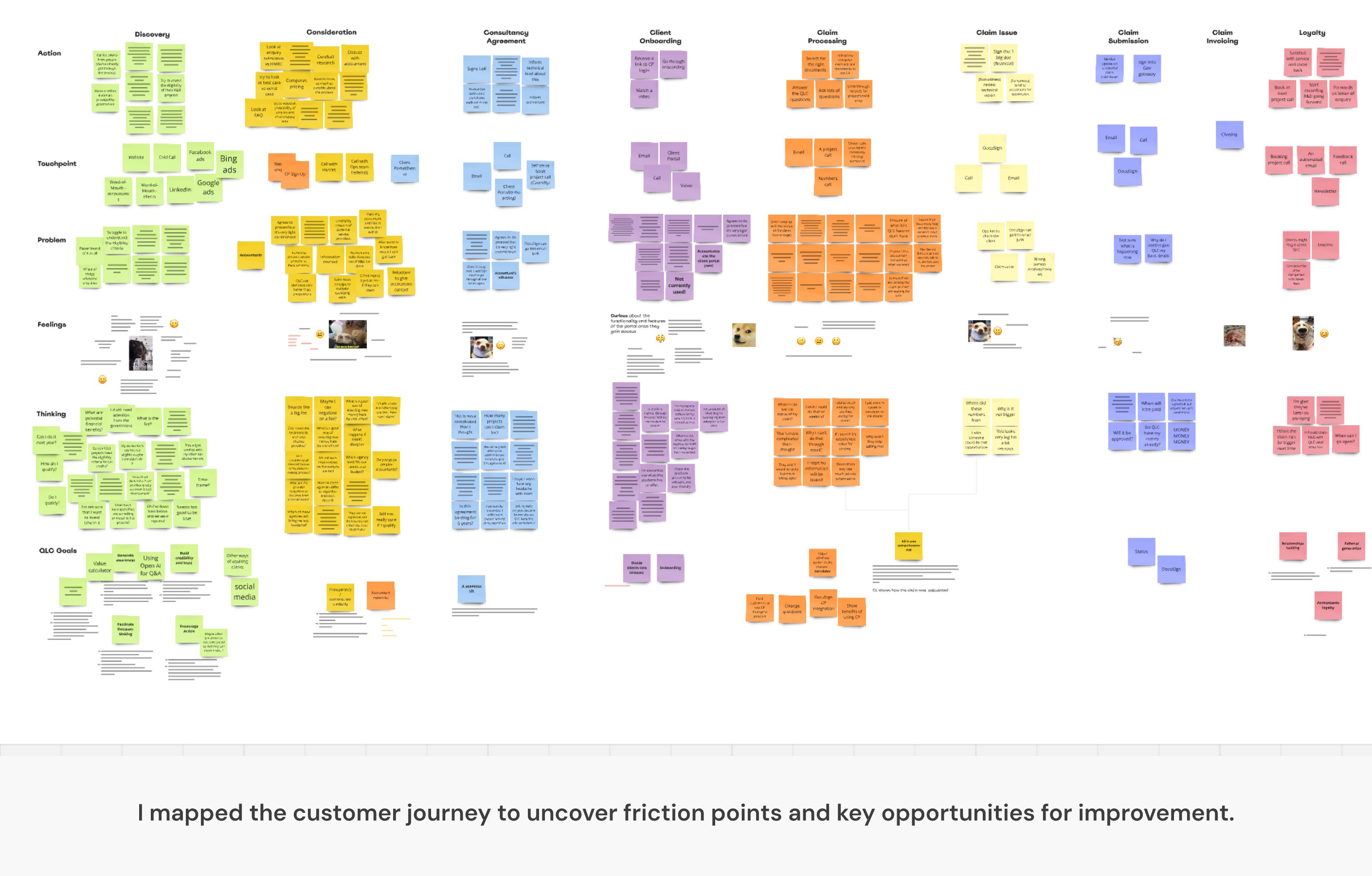
Understanding the Problem
Understanding the Problem
Understanding the Problem
To pinpoint issues, I analyzed user behavior, feedback, and analytics:
🔍 User recordings (Hotjar): Identified friction points in the sign-up flow
📊 Analytics: High abandonment rates during onboarding
🗺️ Customer Journey Mapping: Revealed that we had two key user groups—Accountants and Directors
💡 Key insight: Accountants bring in multiple clients, making them a high-value user group—but the onboarding didn’t cater to them!
Without a separate flow for accountants, we were missing a major revenue opportunity
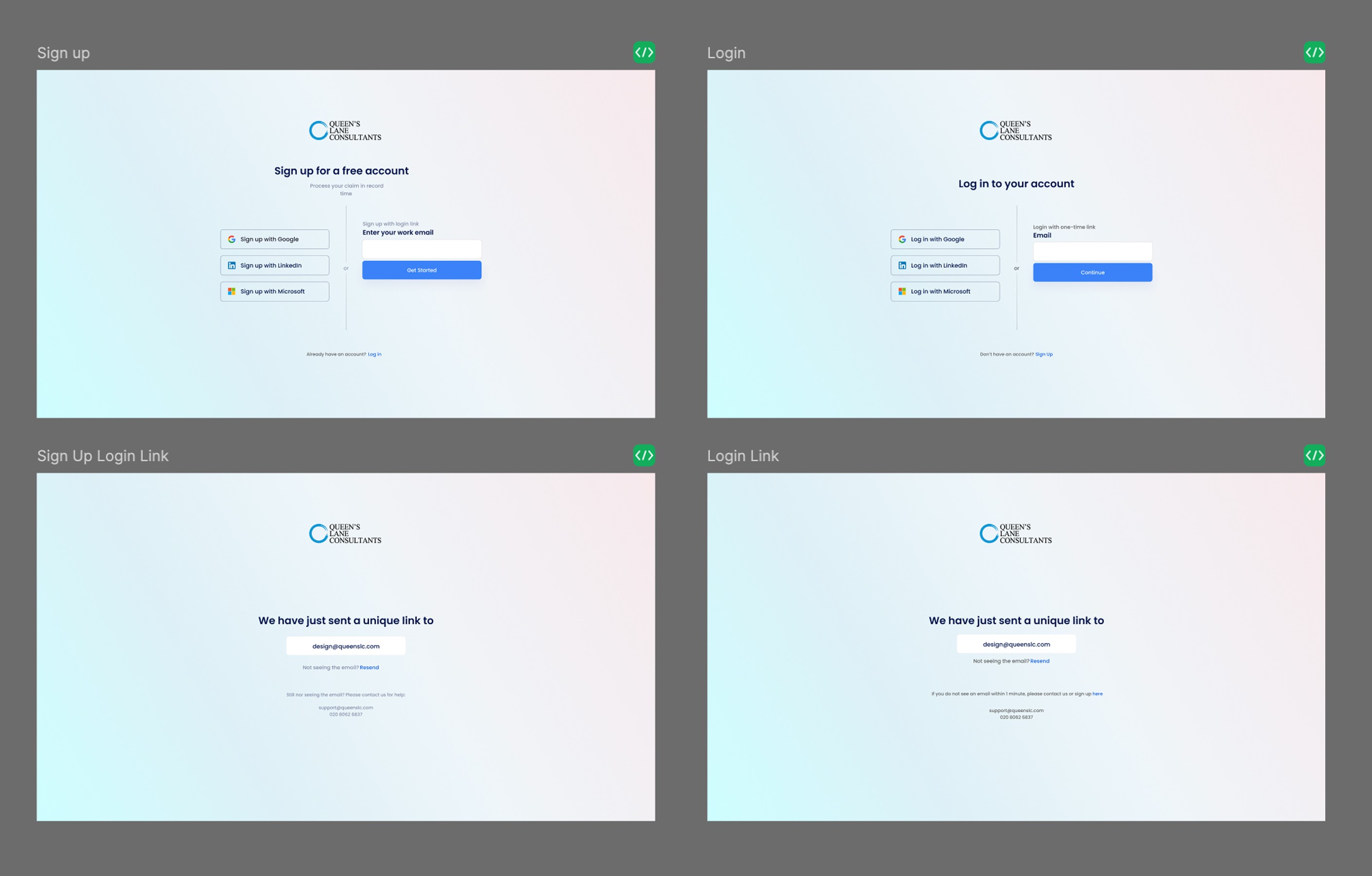
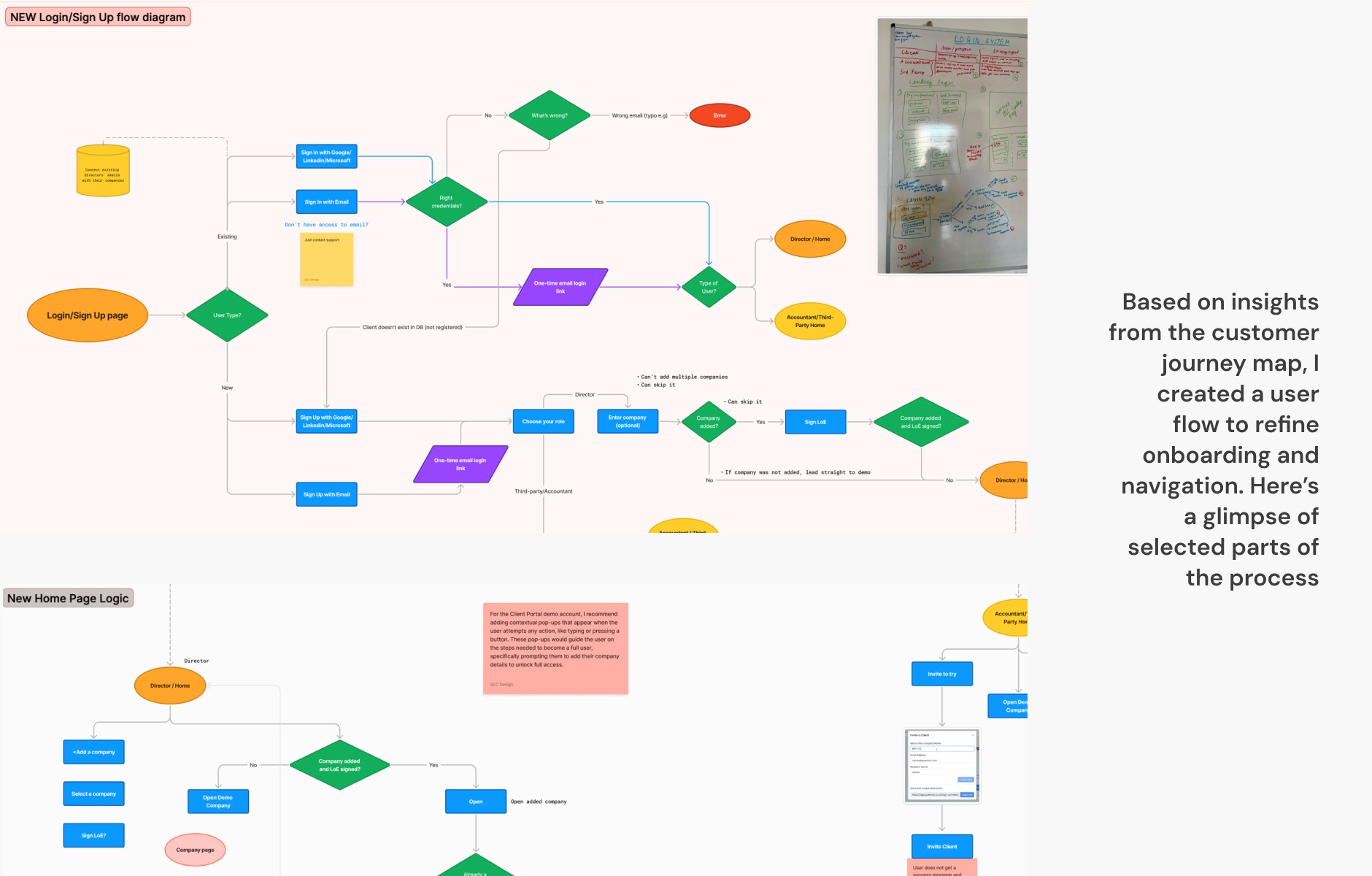
Crafting a More Intuitive Flow
Crafting a More Intuitive Flow
Crafting a More Intuitive Flow
I redesigned onboarding with a user-first approach:
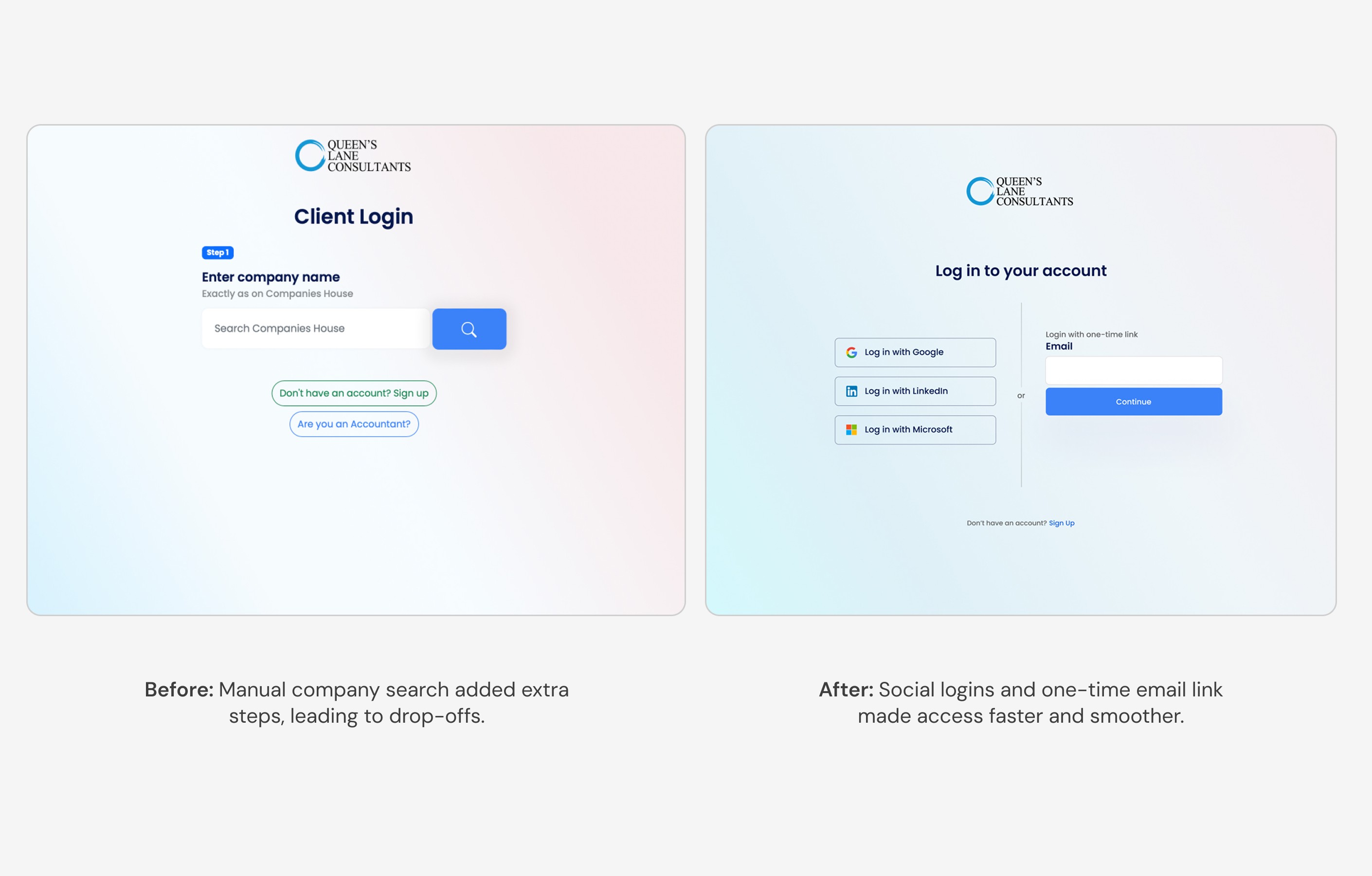
✅ Streamlined steps—removing unnecessary fields and reducing friction
✅ Clearer guidance & CTAs—ensuring users knew what to do next
✅ Mobile-first design—optimized layouts for seamless access on all devices
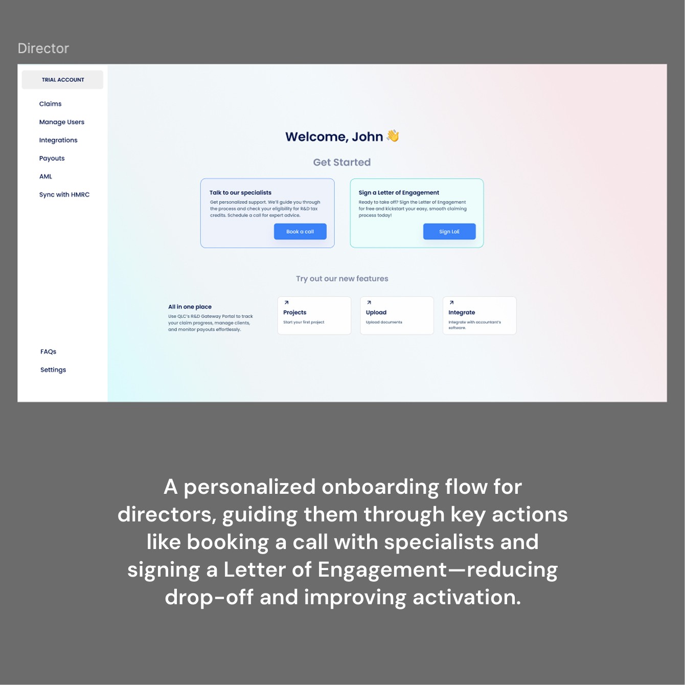
✅ Separate flow for accountants—tailoring the experience to their needs
With research-backed decisions, I created:
🎨 Wireframes & prototypes in Figma for usability testing
🖥️ New UI components for consistency and scalability
⚡ Microinteractions & animations for a smooth, engaging feel
Testing showed 35% faster onboarding completion and reduced hesitation at key steps.
Once launched, the impact was immediate:
📉 30% drop-off rate reduction—users completed onboarding more easily
🚀 Higher engagement—accountants found it easier to onboard multiple clients
🔄 Faster implementation for developers—thanks to scalable components
A well-designed onboarding isn’t just about aesthetics—it directly impacts business success.
What’s Next? Continuous Improvement
What’s Next? Continuous Improvement
What’s Next? Continuous Improvement
Design is never static. Moving forward, team QLC:
📌 Personalizing onboarding further based on user type
📌 A/B testing new CTAs & messaging to optimize engagement
📌 Exploring automation to simplify document uploads